Challenge
Scott challenged Notions Design to develop a name that stood out in the market, one that was different and memorable. The name and designs had to represent community, schools, education and quality as well as keep a connection to office supplies.
Outcome
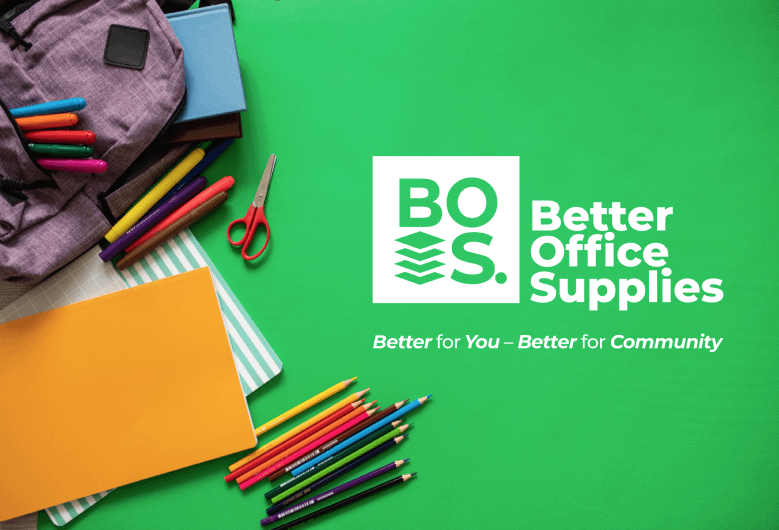
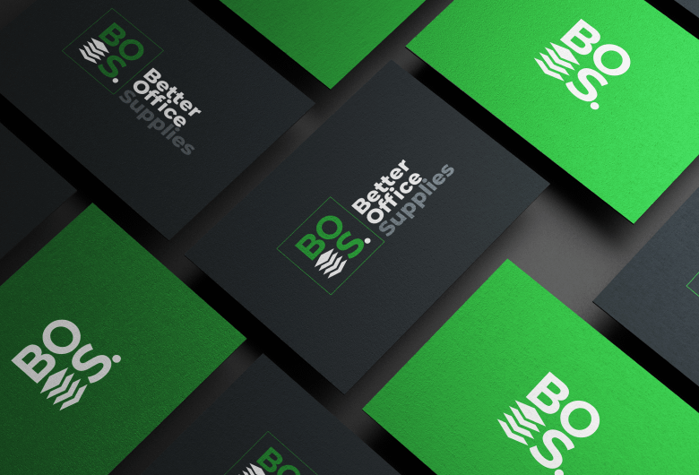
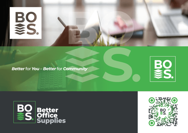
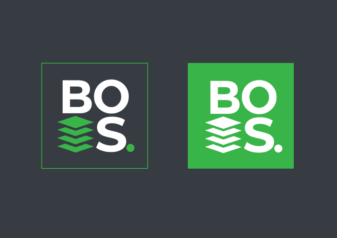
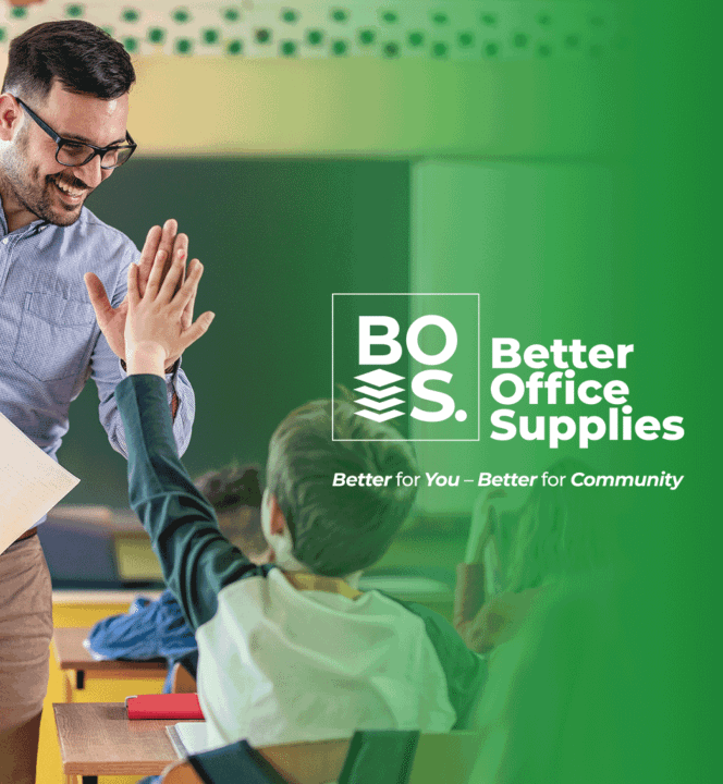
As the connection to community, schools and education was a priority for BOS, Notions Design chose a colour scheme of green and grey to represent growth and reliability. Since BOS’s core business is selling school books /stationery and learning tools and supplies, we incorporated page-related imagery in the logo. This combined met the client brief to connect the two parts of the business and Scott was very pleased with the results.