Challenge
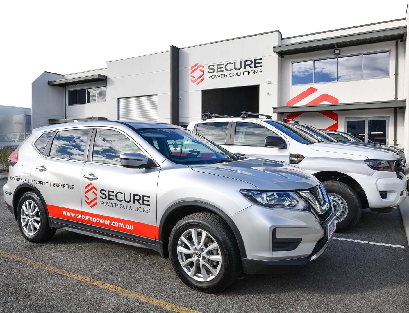
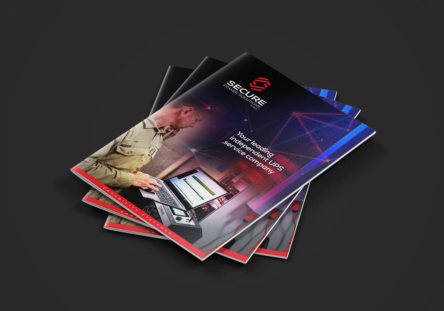
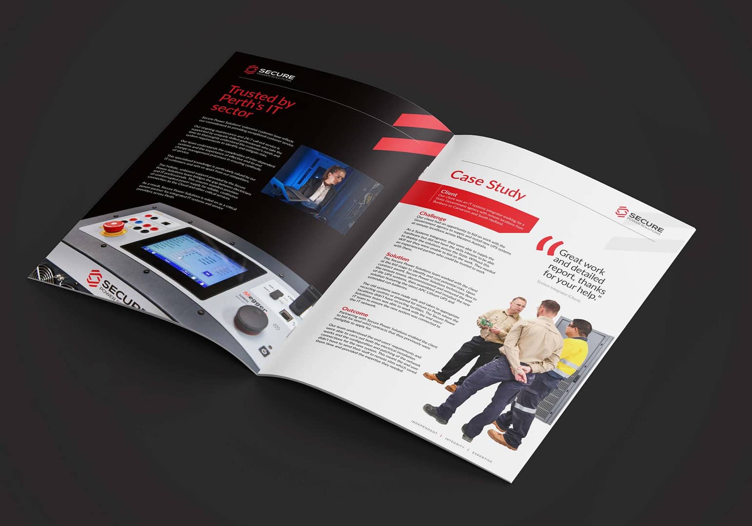
Notions Design was approached by Tony Rutter, Director, Secure Power Solutions, to rebrand his business in time for a special date. Notions Design pre-planned and project managed the design, print and delivery of a suite of marketing materials, vehicle and building signage, and coordinated a substantial photoshoot to meet the tight timeline.
It’s not every day a company celebrates its 10th year in business and we were really excited to be trusted with this task. Notions Design was committed to ensuring we stayed in constant communication with Tony and his team during the design phase, organisation and implementation of all parts of our scope of works, while adhering to a very strict deadline.
Outcome
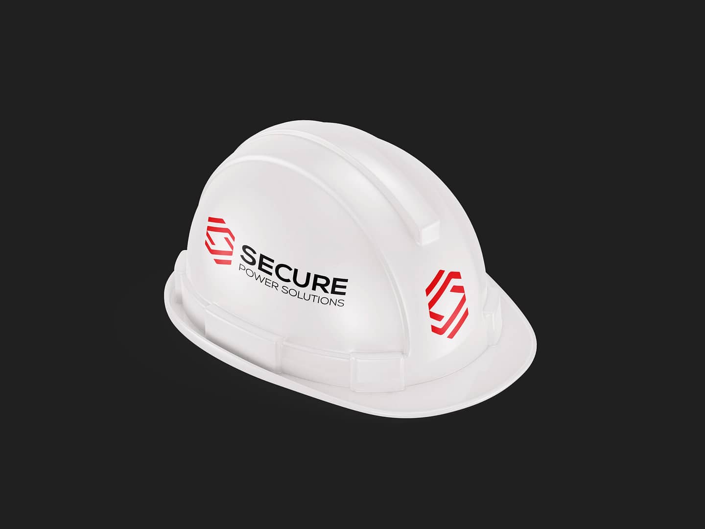
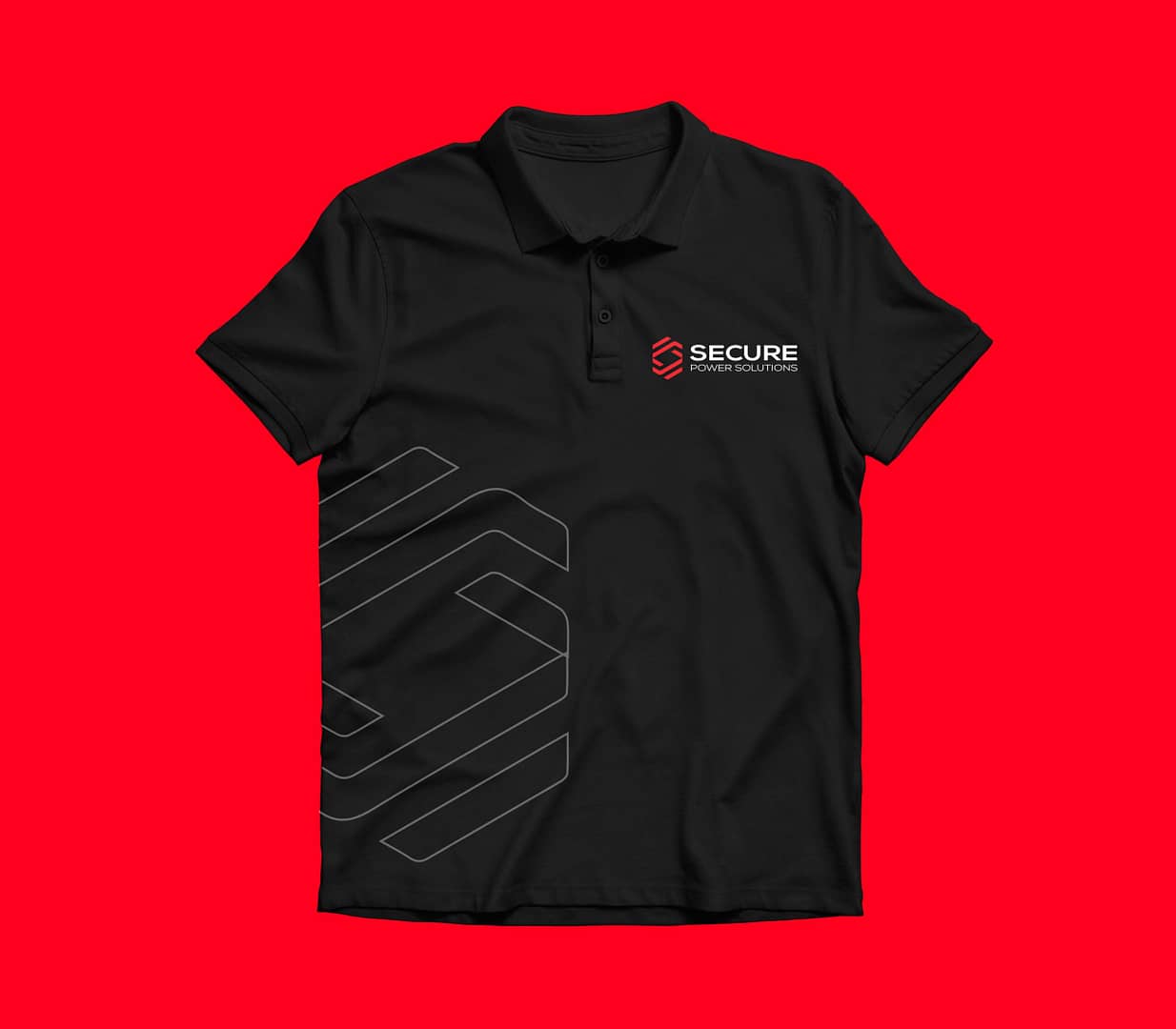
An initial onsite meeting and walk-through of our client’s facilities gave us some insight into Secure Power Systems’ operations, but it was not until we worked through a Brand Discovery session that we really understood the business and its goals. That enabled us to gather a comprehensive brief and confirm scope of works required for their anniversary celebrations. Together, we determined a brand identity that had the legs to grow to keep up with the company’s vision (and the ever-changing technologies of their industry), was required and this was to be supported by a strong, brand, that utilised the existing colour palette.