Challenge
Deanne Murray Conveyancing’s original logo wasn’t accurately reflecting Deanne and what she offers as a service. So, we completely scrapped the original logo and colour scheme and worked together to find a better fit.
Outcome
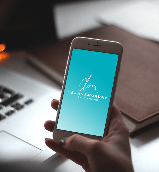
We decided that because her business name uses her personal name, a monogram signature look would work well as a standalone symbol. It also needed to be readable and natural. Using a lower-case option best suited this format and we created stacked and landscape versions for flexibility moving forward.
We incorporated a “coastal feel” colour palette as it more accurately represented her professional and approachable nature and the genuine care she has for her clients.
A turquoise colour coupled with a rich navy blue also reflected Deanne’s clientele who are mainly situated on the coast and it’s where her business is located.
A great result with a very happy client.