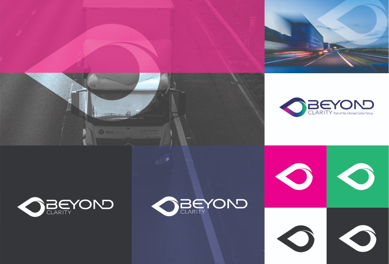
Challenge
Notions Design was challenged to identify a business name and design an identity for a rapidly evolving business. It was essential the new identity reflected the fast-paced world of technology but also left its clients feeling supported, connected and in touch for the long-haul.
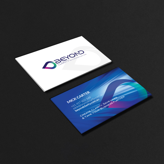
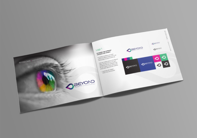
Outcome
We adopted a fresh, modern approach in our design and used strong imagery to represent a map drop point and the connection with the human eye. This focus on direction and projection was coupled with a vibrant, flexible colour scheme and proved a winner with the client.